Using ActionScript 3.0 Components 
Using ActionScript 3.0 Components |
|
|
|
| Customizing the UI Components > Customizing the RadioButton > Using skins with the RadioButton | |||
|
|||
|
|||
|
|||
The RadioButton has the following skins which you can edit to change its appearance:
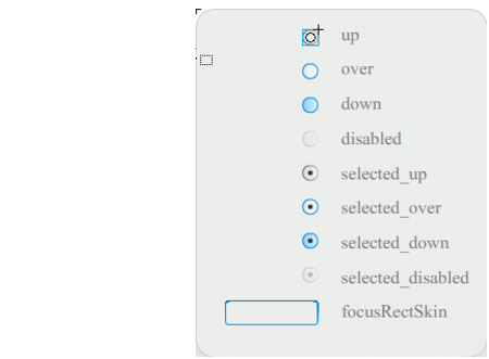
RadioButton skins
If a RadioButton is enabled and not selected, it displays its over skin when a user moves the pointer over it. When a user clicks a RadioButton, it receives input focus and displays its selected_down skin. When a user releases the mouse, the RadioButton displays its selected_up skin. If a user moves the pointer out of the RadioButton's hit area while pressing the mouse button, the RadioButton redisplays its up skin.
If a RadioButton is disabled, it displays its disabled state, regardless of user interaction.
The following example replaces the selected_up skin that indicates the selected state.
 To create a new RadioButton selected_up skin:
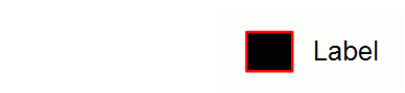
The RadioButton in the selected state should appear similar to the one in the following illustration.
|
|||
|
|||
|
|||
|
|
|
|