Using ActionScript 3.0 Components 
Using ActionScript 3.0 Components |
|
|
|
| Customizing the UI Components > Customizing the ProgressBar > Using skins with the ProgressBar | |||
|
|||
|
|||
|
|||
The ProgressBar component uses skins to represent the progress bar track, the completed bar, and an indeterminate bar as shown in the following illustration.
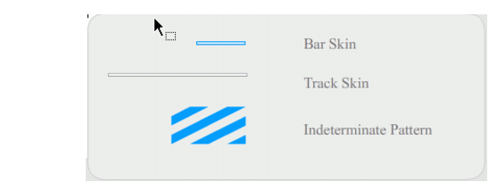
ProgressBar skins
The bar is placed over the track skin, using the barPadding to determine the positioning. The assets are scaled using 9-slice scaling.
The indeterminate bar is used when the ProgressBar instance's indeterminate property is set to true. The skin is resized vertically and horizontally to fit the size of the ProgressBar.
You can edit these skins to change the appearance of the ProgressBar. For example, the following example changes the color of the indeterminate bar.
 To change the color of the indeterminate bar by editing its skin:
The ProgressBar should appear as shown in the following illustration.

|
|||
|
|||
|
|||
|
|
|
|