Using ActionScript 3.0 Components 
Using ActionScript 3.0 Components |
|
|
|
| Customizing the UI Components > Customizing the NumericStepper > Using skins with the NumericStepper | |||
|
|||
|
|||
|
|||
The NumericStepper component has skins to represent the up, down, disabled, and selected states of its buttons.
If a stepper is enabled, the down and up buttons display their over states when the pointer moves over them. The buttons display their down state when pressed. The buttons return to their over state when the mouse is released. If the pointer moves off the buttons while the mouse is pressed, the buttons return to their original state.
If a stepper is disabled, it displays its disabled state, regardless of user interaction.
A NumericStepper component has the following skins:
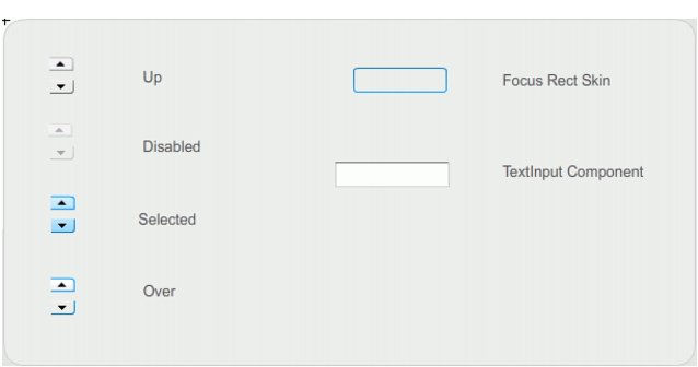
NumericStepper skins
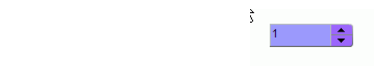
 To change the color of the NumericStepper text background and the buttons in the up state:
The NumericStepper instance should appear as it shown in the following illustration:
|
|||
|
|||
|
|||
|
|
|
|