Using ActionScript 3.0 Components 
Using ActionScript 3.0 Components |
|
|
|
| Customizing the UI Components > Customizing the CheckBox > Using skins with the CheckBox | |||
|
|||
|
|||
|
|||
The CheckBox component has the following skins, which you can edit to change its appearance.
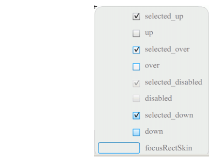
CheckBox skins
This example changes the outline color and background color of the component in its up and selectedUp states. You would follow similar steps to change the skins for other states.
 To customize CheckBox skins:
 |
|||
|
|||
|
|||
|
|
|
|