Using ActionScript 3.0 Components 
Using ActionScript 3.0 Components |
|
|
|
| Customizing the UI Components > Customizing the Button > Using skins with the Button | |||
|
|||
|
|||
|
|||
The Button component uses the following skins that correspond to its different states. To edit one or more skins to change the Button's appearance, double-click the Button instance on the Stage to open a palette of its skins, as shown in the following illustration:
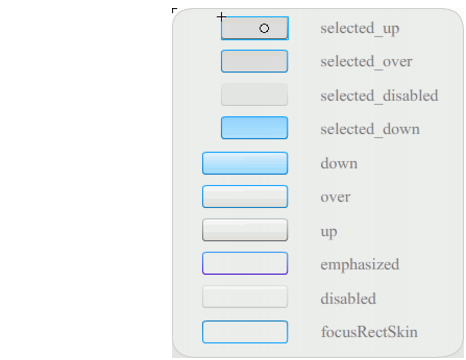
Button skins
If a button is enabled, it displays its over state when the pointer moves over it. The button receives input focus and displays its down state when it's pressed. The button returns to its over state when the mouse is released. If the pointer moves off the button while the mouse is pressed, the button returns to its original state. If the toggle parameter is set to true, the pressed state is shown with the selectedDownSkin, the up state with the selectedUpSkin, and the over state with the selectedOverSkin.
If a Button is disabled, it displays its disabled state, regardless of user interaction.
To edit one of the skins, double-click it to open it in symbol-editing mode, as shown in the following illustration:
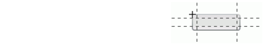
At this point you can use the Flash authoring tools to edit the skin to your liking.
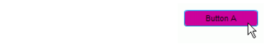
The following procedure changes the color of the Button's selected_over skin.
 To change the color of the Button's selected_over skin:
true.When you move the mouse pointer over the Button, the selected_over state should appear as it does in the following illustration.
|
|||
|
|||
|
|||
|
|
|
|