Using ActionScript 3.0 Components 
Using ActionScript 3.0 Components |
|
|
|
| Customizing the UI Components > About Skins | |||
|
|||
|
|||
|
|||
A component's appearance is made up of graphical elements such as an outline, a fill color, icons, and even other components. A ComboBox, for example, contains a List component and a List component contains a ScrollBar. Together the graphical elements make up the appearance for the ComboBox. A component's appearance changes, however, based on its current state. For example, a CheckBox, without its label, looks something like this when it appears in your application:

A CheckBox in its normal up state
If you click the mouse button and hold it down on the CheckBox, its appearance changes to this:

A CheckBox in its down state
And when you release the mouse button, the CheckBox reverts to its original appearance but now has a check mark to show that it has been selected.

A CheckBox in its selected state
Collectively, the icons that represent the component in its various states are called its skins. You can change a component's appearance in any or all of its states by editing its skins in Flash, just as you would any other Flash symbol. You can access a component's skins in two ways. The easiest way is to drag the component to the Stage and double-click it. This opens a palette of the component's skins, which looks like this for a CheckBox.
: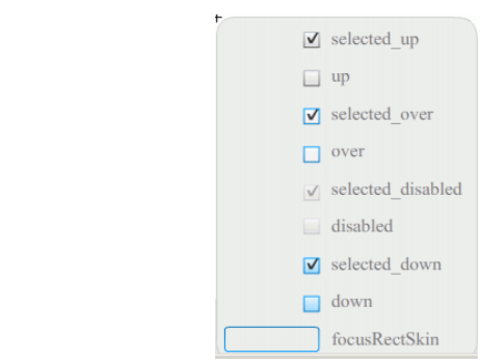
A CheckBox's skins
You can also access a component's skins individually from the Library panel. When you drag a component to the Stage, you also copy it to the library along with a folder of its assets and any other components that it contains. For example, if you drag a ComboBox to the Stage, you will find the following items in the Library panel:
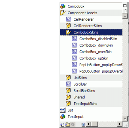
Library panel for the ComboBox
Besides the ComboBox, the Library panel contains the List, ScrollBar, and TextInput components, which are built into the ComboBox, along with a folder of skins for each of these components and a Shared Assets folder that contains elements that these components share. You can edit the skins for any of these components by opening its skins folder (ComboBoxSkins, ListSkins, ScrollBarSkins, or TextInputSkins) and double-clicking the icon for the skin that you want to edit. Double-clicking ComboBox_downSkin, for example, opens the skin in symbol editing mode, as shown in the following illustration:
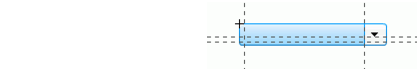
The ComboBox_downSkin
|
|||
|
|||
|
|||
|
|
|
|