Using ActionScript 2.0 Components 
Using ActionScript 2.0 Components |
|
|
|
| Creating an Application with Components > Display gift details | |||
|
|||
|
|||
|
|||
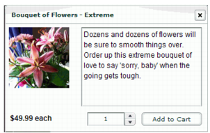
A pop-up window appears in the application when a user clicks a product in the Gift Ideas section. The pop-up window contains component instances that display information about the product, including a text description, an image, and the price. To make this pop-up window, you will create a movie clip symbol and add instances of the Loader, TextArea, Label, NumericStepper, and Button components. The product detail window for Bouquet of Flowers Extreme looks like this:
You will later add ActionScript that dynamically creates an instance of this movie clip for each product. These movie clip instances will be displayed in the Window component, which you added to the library earlier. The component instances will be populated with elements from the external XML file.
The Window component symbol is now added to the library. Later in the tutorial, you will create instances of the Window component using ActionScript.
For movie clip symbols that are in the library but not on the Stage, you must select Export for ActionScript so that you can manipulate them using ActionScript. (Exporting in first frame means that the movie clip is available as soon as the first frame loads.) Later in the tutorial you will add ActionScript that will generate an instance of the movie clip dynamically each time a user clicks a product in the Gift Ideas section.
false for autoLoad and false for scaleContent.
The Loader component instance will be used to display an image of the product. The false setting for autoLoad specifies that the image will not load automatically. The false setting for scaleContent specifies that the image will not be scaled. Later in the tutorial you will add code that loads the image dynamically, based on the product that the user selects in the Gift Ideas section.
false. For html, select true. For wordWrap, select true.
The TextArea component instance is used to display a text description of the selected product. The selected settings specify that the text cannot be edited by a user, that it can be formatted with HMTL tags, and that lines will wrap to fit the size of the text area.
autoSize, select left. For html, select true.
The Label component instance will display the price of the product and the price qualifier (the quantity of products indicated by the specified price, such as "each" or "one dozen.")
minimum, enter 1.
Setting minimum to 1 specifies that the user must select at least one of the products in order to add the item to the cart.
label, enter Add To Cart. |
|||
|
|||
|
|||
|
|
|
|