ActionScript 2.0 Components Language Reference 
ActionScript 2.0 Components Language Reference |
|
|
|
| CellRenderer API > Understanding the List class > About the composition of the List component | |||
|
|||
|
|||
|
|||
List components are composed of rows. These rows display rollover and selection highlights, are used as hit states for row selection, and play a vital part in scrolling. Aside from selection highlights and icons (such as the node icons and expander arrows of a Tree component), a row consists of one cell (or, in the case of the DataGrid component, many cells). In the default case, these cells are TextField objects that implement the CellRenderer API. However, you can tell a List component to use a different class of component as the cell for each row. The only requirement is that the class must implement the CellRenderer API, which the List component uses for communicating with the cell.
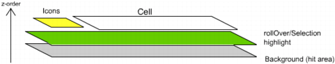
The stacking order of a row in a List or DataGrid component
|
NOTE |
If a cell has button event handlers ( |
|
|||
|
|||
|
|||
|
|
|
|