Options tab for form field properties
The options available on this tab change according to the type of form field selected. The Options tab appears for all form field types except digital signatures.
 Barcode
The Options tab for barcode field properties contains the following:
- Symbology
-
Includes the PDF417, QR Code, and Data Matrix barcode types.
Note: If your organization processes forms by multiple methods, select the method that accommodates the lowest quality barcode images. For example, if forms will be returned by fax and mail, choose Fax Server as the decode condition to ensure high read rates on all forms. - Compress Data Before Encoding To Barcode
-
Specifies that data will be compressed before it is encoded. Data is compressed with the Flate compression method. Compressed data usually requires less storage space in the barcode, allowing more data to be stored. In general, select this option if you will use the Acrobat barcode forms decoder to interpret the returned data. Do not select this option if you will use a handheld barcode scanner, because most of these cannot decode compressed data.
- Decode Condition
-
The preset decode conditions represent recommended starting points that you can adjust by clicking the Custom button.
- Custom
-
Opens a dialog box in which you can select custom processing parameters that are best for your specific scanning and faxing hardware. (The available options vary according to barcode types.)
- X Dimension
-
Width, in mils (1 mil = .001 inch or .0254 mm), of the cell.
- Y/X Ratio
-
Height/width ratio of the cell. For example, for a data cell that is twice as high as it is wide, enter 2. (Available only for PDF417 barcodes.)
Note: If you are planning to decode the barcode using a handheld laser scanner, avoid creating barcodes wider than 4 inches (10.2 cm). Taller and narrower barcodes generally work better with handheld scanners. Barcode height and width will not be an issue if you are using an Adobe barcode decoder (available separately). - Error Correction Level
-
Corresponds to the level of data redundancy that is added to the barcode to correct any potential decoding errors. Higher levels provide more redundancy and a more robust barcode that will generate more successful decode results. However, higher levels will also result in a larger barcode and a reduced ability to encode user-supplied or form structure data into the barcode. A more robust barcode can reduce problems created by pen marks, poor print quality, degradation caused by fax transmission, or folds in the document. This option is available for PDF417 and QR Code barcodes.
- Manage Barcode Parameters
-
Enables you to save your custom barcode selections in a file. You can then export the file and make it available to other form authors in your organization.
Check boxes
- Check box style
-
Specifies the shape of the marker that appears inside the check box when the user selects it: Check (the default), Circle, Cross, Diamond, Square, or Star. This property does not alter the shape of the check box itself.
Note: The size of the marker inside the check box is determined by the size of the font you specify on the Appearance tab. - Export Value
-
Specifies a value to represent the item if the data will be exported. If left blank, the entry for Name on the General tab is used as the export value.
- Check Box Is Checked By Default
-
Shows the check box selected unless the user deselects it.
Combo box and list box
For either combo boxes or list boxes, you use the Options tab to create a list of items from which the user selects.
Although most of the properties on this tab are common to both these types of form fields, a few are exclusive to one type or the other.
- Item
-
Accepts the text that you type for options that you want to appear on the pop-up menu for the field.
- Add
-
Moves the current entry in Item to the Item List.
- Export Value
-
Where you type in a value to represent the item if the data will be exported. If left blank, the entry for Name on the General tab is used as the export value.
- Item List
-
Displays the choices that will be available on the list.
Note: The highlighted item in the Item List box appears as the default selected item in the combo box field. To change the default item, highlight another item from the list. - Up and Down arrows
-
Changes the order in which the items are listed on the combo-box list. These buttons are not available if Sort Items is selected.
Note: The highlighted item in the Item List box appears as the default selected item in the combo box field. To change the default item, highlight another item from the list. - Delete
-
Removes the selected item from the list.
- Sort Items
-
Arranges the listed items numerically and alphabetically. A numeric sort (if applicable) is performed before an alphabetical sort.
- Allow User To Enter Custom Text
-
(Combo boxes only) Enables users to enter a value other than the ones in the list.
- Check Spelling
-
(Combo boxes only) Checks the spelling of user-entered text. This option is available only if Allow User To Enter Custom Text is selected.
- Multiple Selection
-
(List boxes only) Enables users to choose more than one item in the list.
- Commit Selected Value Immediately
-
Saves the value as soon as the user selects it. If this option is not selected, the value is saved only when the user tabs out of the current field or clicks another form field. For list boxes only, this option is not available if Multiple Selection is selected.
Radio buttons
- Button Style
-
Specifies the shape of the marker that appears inside the button when the user selects it: Check, Circle (the default), Cross, Diamond, Square, or Star. This property does not alter the shape of the radio button itself.
- Export Value
-
Identifies the radio button and differentiates it from other radio buttons that share the same Name value.
- Button Is Checked By Default
-
Sets the selection state of the button when the user first opens the form.
- Buttons With The Same Name And Value Are Selected In Unison
-
Allows single-click selection of multiple related radio buttons. For example, if the user selects a radio button that has the same field name and export value as another, both radio buttons are selected.
Text box
Text fields accept user input, which can be alphabetic characters, numbers, or both.
- Alignment
-
Aligns the text left, right, or center within the field.
- Default Value
-
Specifies the text that appears until the user overwrites it by typing in the field. Enter the default value by typing in this option.
- Multi-line
-
Allows more than a single-line entry in the text field.
- Scroll Long Text
-
Compensate for text that extends beyond the boundaries of the text field.
- Allow Rich Text Formatting
-
Allows users to apply styling information to the text, such as bold or italic. This might be useful in certain text fields where such styling information is important to the meaning of the text, such as an essay.
- Limit Of Characters
-
Allows entries of up to the number of characters you specify.
Note: If you entered a default value, that value is clipped to this limit. - Password
-
Displays the user-entered text as a series of asterisks (*). This option is available only if Check Spelling is deselected.
- Field Is Used For File Selection
-
Allow user to enter a file path as the field’s value when a file is submitted along with the form. This option is available only when Scroll Long Text is the only selected option on the Options tab.
- Check Spelling
-
Checks the spelling of user-entered text.
- Comb Of Characters
-
Spreads the user-entered text evenly across the width of the text field. If a border color is specified on the Appearance tab, each character entered in the field is separated by lines of that color. This option is available only when no other check box is selected.
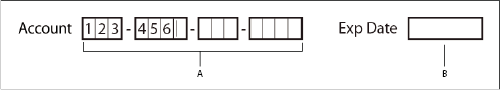
- A.
- Four text fields with a border color, using the Comb property
- B.
- Text field without the Comb property